Monday
Thursday
VANITAS (semiotics project)
Semiotics is the study of sign processes, significance and what they communicate. It includes the study of signs and symbols read individually as well as what they can represent when grouped into systems. It explores the way meaning is constructed and understood.
Formalized by the Vienna Circle, semiotics can be broken down into three categories:
Semantics - The relationship between signs and the things they refer to i.e. their denotations.
Syntactics - The relationship of signs to each other in formal structures.
Pragmatics - The relationship between signs and the way they impact those who use them.
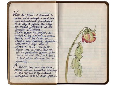
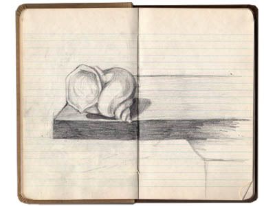
The first part of this brief asked us to choose an object and draw it five times and then to explore any meaning, symbolism and connotations that they may hold. I wanted to focus on how one's preconceived knowledge of an objects effects the way we might interpret it in specific situations.
A flower can and does have many varied symbolic meanings. It can represents the natural biological world, growth and new life. This can be contrasted with death when portrayed in a decaying state and conjures up connotations of transience and mortality. Flowers can be exchanged at times of celebration as well as at times of sadness; they are taken out of their natural organic environment and used by humans as a symbol of emotion.
The second part of this brief required us to write about a specific image and analyze the way semiotics is put to use:
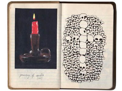
In early 17th century, notably in the Netherlands, a style of painting emerged that contained an array of objects used to symbolise the inevitability of death and the transient nature of earthly objects, achievements and pleasures. It was labeled Vanitas, deriving from a biblical quotation in Ecclesiastes 1:2 that states, 'Vanity of vanities, all is vanity.' Generally addressed in still life paintings, the theme of Vanitas aims to iterate and warn the viewer of the fleeting nature of life and the importance of not placing too high a value on physical objects.
The articles that make up the still life are carefully chosen in order to deliver this message, each carrying a different symbolic meaning that when placed together contributes to a clear understanding of the overall message of mortality. Herman Steenwyck's, 'Still Life: An Allegory of the Vanities of Human Life' painted in c.1640, is a quintessential example of a Dutch Vanitas painting.
It is executed with immense attention to detail which both highlights the artists skill as well as providing the painting and its message with a vivid sense of realism. Interestingly, before the genre of Vanitas painting had gained widespread popularity, it was thought the objects were chosen solely to emphasize the ability of the painter. This is an example of how symbolism can go unnoticed until its meaning is made explicit, and only after a period of general consciousness of a concept, does the symbolism exists with no need of explanation.
The reoccurring objects that constitute a Vanitas still life vary in how symbolically obvious they are. The skull, which is this example is placed centrally and is the focal point of the image, is a universal symbol of death and the ultimate momento mori. Timepieces, especially hour glasses but in this instance the object lying on the table which resembles a pocket watch, is used to reinforce the idea that ones time is limited and will eventually run out. Candles, and in this case the gold oil lamp which has just been extinguished, also mark the brevity of life
.
Formalized by the Vienna Circle, semiotics can be broken down into three categories:
Semantics - The relationship between signs and the things they refer to i.e. their denotations.
Syntactics - The relationship of signs to each other in formal structures.
Pragmatics - The relationship between signs and the way they impact those who use them.

The first part of this brief asked us to choose an object and draw it five times and then to explore any meaning, symbolism and connotations that they may hold. I wanted to focus on how one's preconceived knowledge of an objects effects the way we might interpret it in specific situations.
A flower can and does have many varied symbolic meanings. It can represents the natural biological world, growth and new life. This can be contrasted with death when portrayed in a decaying state and conjures up connotations of transience and mortality. Flowers can be exchanged at times of celebration as well as at times of sadness; they are taken out of their natural organic environment and used by humans as a symbol of emotion.
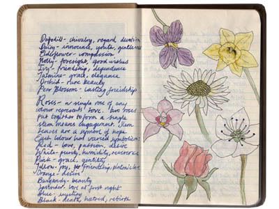
Within this specific types of flowers have evolved to represent different things. For example:
Black lotus - platonic love
Blue violet - modesty, faithfulness
Carnation - pride, beauty, deep love
(and within this species different colours have further meanings such as pink - motherly/womanly love, red - admiration, stripped - refusal, white - pure love. etc.)
Daffodil - chivalry, regard, devotion
Daisy - innocence, youth, gentleness
Elderflower - compassion
Holly - foresight, good wishes
Ivy - friendship, dependence
Jasmine - grace, elegance
Orchid - rare beauty
Pear Blossom - lasting friendship

Roses are a popular flower that has developed an array of different meanings.
A single rose of any colour represents love. Two roses put together to form a single stem means engagement. Stem leaves are a symbol of hope. Each colour has a different significance:
Red - love, passion, desire
White - purity, humility, reverence
Pink - grace, gentility
Yellow - joy, friendship, platonic love
Orange - desire
Burgundy - beauty
Lavender - love at first sight
Blue - mystery
Black - death, hatred, rebirth
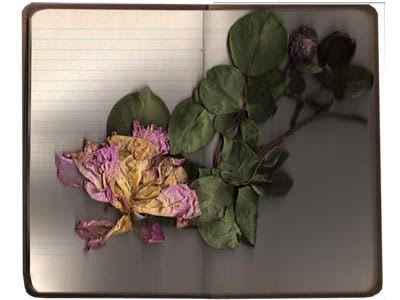

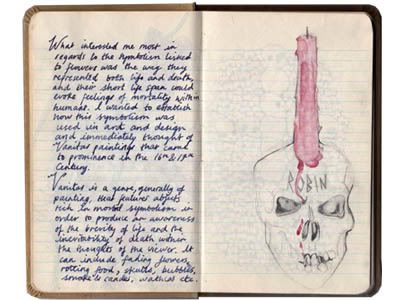
What interested me most in regards to the symbolism linked to flowers is the way they can represent both life and death, and how their short life span can evoke feelings of mortality within humans. I wanted to establish how this symbolism was used in art and design and immediately thought of Vanitas paintings. Vanitas is a genre of painting that utilizes symbolism in order to channel a specific message of the brevity of life and the inevitability of death to the viewer.

The second part of this brief required us to write about a specific image and analyze the way semiotics is put to use:
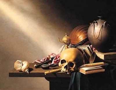
Herman Steenwyck
'Still Life: An Allegory of the Vanitas Human Life'
In early 17th century, notably in the Netherlands, a style of painting emerged that contained an array of objects used to symbolise the inevitability of death and the transient nature of earthly objects, achievements and pleasures. It was labeled Vanitas, deriving from a biblical quotation in Ecclesiastes 1:2 that states, 'Vanity of vanities, all is vanity.' Generally addressed in still life paintings, the theme of Vanitas aims to iterate and warn the viewer of the fleeting nature of life and the importance of not placing too high a value on physical objects.
The articles that make up the still life are carefully chosen in order to deliver this message, each carrying a different symbolic meaning that when placed together contributes to a clear understanding of the overall message of mortality. Herman Steenwyck's, 'Still Life: An Allegory of the Vanities of Human Life' painted in c.1640, is a quintessential example of a Dutch Vanitas painting.

It is executed with immense attention to detail which both highlights the artists skill as well as providing the painting and its message with a vivid sense of realism. Interestingly, before the genre of Vanitas painting had gained widespread popularity, it was thought the objects were chosen solely to emphasize the ability of the painter. This is an example of how symbolism can go unnoticed until its meaning is made explicit, and only after a period of general consciousness of a concept, does the symbolism exists with no need of explanation.
The reoccurring objects that constitute a Vanitas still life vary in how symbolically obvious they are. The skull, which is this example is placed centrally and is the focal point of the image, is a universal symbol of death and the ultimate momento mori. Timepieces, especially hour glasses but in this instance the object lying on the table which resembles a pocket watch, is used to reinforce the idea that ones time is limited and will eventually run out. Candles, and in this case the gold oil lamp which has just been extinguished, also mark the brevity of life

.
A book with pages turning, like the one featured, represents a thirst for knowledge and the human desire to try and immortalise their thoughts via the written word, while musical instruments are used to comment on the ephemerality of the sensory pleasures. The beautifully polished shell, which appears lying precariously on the edge of the table away from the cluster of the other objects, is a symbol of wealth. It is rare specimen generally found in South East Asia implying the owner would have to be affluent in order to posses such a exotic artifact.

Other devices which are used in similar paintings to hint at wealth, include globes, maps and occasionally modal ships, all of which indicate travel, a huge luxury at that time. Like the presence of books, these would also reinforce mans desire to learn and explore, constantly trying to gain knowledge of the unknown. Other commonly used objects that represent the overall theme of mortality include fading flowers and rotting fruit to illustrate the inevitable decay and death of all living organisms, as well as dead game and bubbles which signify the suddenness of death.
Whilst some of the objects have very obvious semantics, others are more obscure and rely on the pragmatic placing amongst other items of a similar macabre nature in order to clarify and construct the overall message. It contains both semiotically closed and semiotically open systems of representation. In a semiotically closed system the meaning is not open for interpretation and is dictated by an definitive established interpretation, an example of this type of system in modern society is road signs. A semiotically open system in contrast has an unresolved meaning. A vanitas painting is dense in symbolism and it relies on the viewer deciphering these more obscure systems before they can appreciate it fully. However, this is not always straightforward as some carry a multitude of meanings, for example when one set of meanings that denotes say pleasure is balanced by an opposing one such as death. Here, semiotically closed objects such as the skull sets the overall tone ot the image which alludes to the specific way in which the semiotically open elements are designed be interpreted.
Having identified the tensions that exist, I think it is questionable as to whether the painter is able to resolve and successfully define the overall message. It is important to note that these paintings gained popularity at a time when religion was often the focal point of peoples lives and society itself is caught balancing between recognizing accomplishment and anxiety. Whilst many of the objects balance a variety of possible interpretations, the unification is intended to offer a general understanding. Yet despite intention, the meaning can only truly be defined by the individual. While the overt pictorial message coupled with the moral undertones was designed to encourage individuals to relinquish earthly pleasures in pursuit for a fulfilling and spiritual existence, some might construe that one ought to enjoy these pleasures before its too late; an exhortation to seize the day.
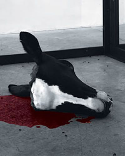
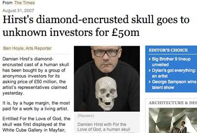
As time has passed and religion now longer governs society to the extent it once did, the genre has evolved considerably. Nowadays, the use of vanitas symbolism whilst still reminding one of the brevity of life, is generally not linked to faith but to society in general. Damien Hirst for instance often references vanitas in his work, for example in 'A Thousand Years' 1989, where a glass encasement houses a flayed cows head, maggots, flies and an insectocutor. This represents, in a very different manner, the certainty of death and the struggle to find meaning in ones life in the time prior to this pending inevitability.
Tim Head is another example of an artist who takes inspiration from this style of painting but brings it very up to date exploring controversial issues that face modern society for example genetic modification which relates back to the natural human desperation to try and understand and control their environment.

The photograph 'Erasers II; On the Rocks' 1987, features a seductive yet contaminated landscape filled with small rubber erasers moulded into the shape of human skulls surrounded by toy airplanes. Whilst the objects in themselves are playful, the way in which they are portrayed raises more serious questions about the consequences of our fast paced consuming, polluting life styles and the burden placed upon the environment as a result. What is interesting when comparing this piece to a typical 17th Century vanitas painting is the way in which the skull is perceived by the different audiences. The image of a skull in modern culture no longer necessarily incites thoughts of fear and death. Its audience has become immune to this image, it is used almost decoratively, and in Head's piece the fact it is represented in the format of what one would assume is a child's rubber shows it is semiotically less poignant. Another example of this is the way Andy Warhol transfers the image of a skull onto a canvas as blankly as he does Marilyn Monroe's face.

Having identified the tensions that exist, I think it is questionable as to whether the painter is able to resolve and successfully define the overall message. It is important to note that these paintings gained popularity at a time when religion was often the focal point of peoples lives and society itself is caught balancing between recognizing accomplishment and anxiety. Whilst many of the objects balance a variety of possible interpretations, the unification is intended to offer a general understanding. Yet despite intention, the meaning can only truly be defined by the individual. While the overt pictorial message coupled with the moral undertones was designed to encourage individuals to relinquish earthly pleasures in pursuit for a fulfilling and spiritual existence, some might construe that one ought to enjoy these pleasures before its too late; an exhortation to seize the day.
As time has passed and religion now longer governs society to the extent it once did, the genre has evolved considerably. Nowadays, the use of vanitas symbolism whilst still reminding one of the brevity of life, is generally not linked to faith but to society in general. Damien Hirst for instance often references vanitas in his work, for example in 'A Thousand Years' 1989, where a glass encasement houses a flayed cows head, maggots, flies and an insectocutor. This represents, in a very different manner, the certainty of death and the struggle to find meaning in ones life in the time prior to this pending inevitability.

Tim Head is another example of an artist who takes inspiration from this style of painting but brings it very up to date exploring controversial issues that face modern society for example genetic modification which relates back to the natural human desperation to try and understand and control their environment.

The photograph 'Erasers II; On the Rocks' 1987, features a seductive yet contaminated landscape filled with small rubber erasers moulded into the shape of human skulls surrounded by toy airplanes. Whilst the objects in themselves are playful, the way in which they are portrayed raises more serious questions about the consequences of our fast paced consuming, polluting life styles and the burden placed upon the environment as a result. What is interesting when comparing this piece to a typical 17th Century vanitas painting is the way in which the skull is perceived by the different audiences. The image of a skull in modern culture no longer necessarily incites thoughts of fear and death. Its audience has become immune to this image, it is used almost decoratively, and in Head's piece the fact it is represented in the format of what one would assume is a child's rubber shows it is semiotically less poignant. Another example of this is the way Andy Warhol transfers the image of a skull onto a canvas as blankly as he does Marilyn Monroe's face.

Whilst faith may no longer govern Vanitas influences, the overall message that it carries is still poignant. It alludes to questions concerning life and mortality that seem, at times, unavoidable as a human being. The most interesting point for me that appears to slightly undermine the entire concept behind a Vanitas piece, is that whilst supposedly aiming to warn against frivolous pastimes and earthly possessions, the painting itself becomes a valuable and collectable commodity. The irony being that the artwork becomes a vanitas object in itself.

LIQUID GOLD (joke project)
This brief called for the formulation of an original joke. The definition of a joke is something that is said or done in order to evoke laughter or amusement. This may seem straightforward however there are so many varying possibilities of structure and the reaction is so objective. Some types of jokes are designed to be obvious and overt such as slapstick, whereas some are subtle and can only be appreciated by a specific audience. I wanted to move away from the traditional format which generally consists of an amusing story with a punch line. My aim was to focus on creating an amusing situation from the obscure and unexplained. This video, which was created in collaboration with Samuel Parker, a fellow Camberwell student, aims to confuse the audience until the end section where a popular comedic format is used to explain the situation.
Untitled from helen ralli on Vimeo.
TEAMWORK
Untitled from helen ralli on Vimeo.
The text:
Prior to it turning sour, we walked along the coast.
The hair on her neck was red, she had a tag on her forehead & her skin was brown.
My skin was browner, meaning that I always had a slight advantage, of which I could only make up for by means of prick or fried chicken.
I was not an overwhelming success in the nether regions, but she was a very small girl & it didn't take much force to make her shake.
I was not an overwhelming success in the nether regions, but she was a very small girl & it didn't take much force to make her shake.
I guess you could say that her hunger for the bucket hindered her figure,
but in the heat it was neither snake nor chicken she was craving for... it was lucozade.
And how I did like to taste her tongue after she swallowed.
Liquid gold.
This, however, like too many pleasantries, carried a problem.
This, however, like too many pleasantries, carried a problem.
My woman was not one for teeth brushing & after an hour or two,
the nectar regressed into something more potent.
The fizz lost, benzo badness leeking into her bloodstream, just to be sure,
''Inner inhibition is becoming a necessity!'' she'd say to me.
I just wanted to twist her when she threw that whopper.
But such a jigger jigger opening.
And until I laid a wet one, everything would stay that way.
TEAMWORK

PERSUIT (mike perry)

my names helen ralli, im a graphic design student at camberwell college of art in london. i was set a project whereby i had to discuss my top ten influences and as a follow on to that, get in conatct with one of them. i actually choose to write about your work as my number one influence despite not being hugely similar to my own, i very much enjoy the general aesthetic of your work, notably your hand drawn lettering.
my brief is to infact create a three minute documentary interviewing the choosen person. regardless of any other factors i realise this would prove highly challenging due to distance. i also apprieciate that you are most probably an extremely busy human being, however if you could spare a moment just to consider the possibility of making some contact even if it was perhaps just over email, it would be much appreciated indeed.
i hope all your current projects are going wonderfully and to hear from you soon.
much appreciated, helen ralli
Helen,
Thanks for the wonderful email. I would be thrilled to help you out. Please let me know what I can do. If you wanna try and figure out how to record a ichat or skype conversation I am sure that would fulfill your video requirements.
Let me know,
All my best,
Mike
that would be just great.
im going to do some investigating about skype etc and i'll get back to you asap.
also, if, by some miracle, i find myself in new york in the next couple of weeks, would it be possible to perhaps come meet you somewhere? this is unfortunatley unlikely but just in case
also shall i send you some of the work ive done recently? perhaps your interested.
thanks for getting in contact.
helen
Of course come by if you are in new york. Let me know though I am going to be doing some traveling. Also I am going to be in an art show in london in april. So I will be there.
let me know when you wanna skype and send me your details and I will try and make it work.
All my best,
Mike

I got back in contact with Mike after coming back from Berlin. He said he was traveling but would arrange an interview as soon as he had some available time. Here are the Questions I propose to ask. I sent them to him the other day in order to remind him of the interview and so he might be able to prepare for when we do film the video.
1. Can you recall your favourite brief that you have been given?
2. How did you source all the individuals whos work makes up you book 'hand job'?
3. What/who are your top ten most dominant sources of inspiration?
4. What is your favourite typeface or character you have designed?
5. You live and work in new york, what is going on there specifically in the world of design?
6 .What does your average working day consist of?
7 .If you could change one thing about your job as an illustrator what would it be?
8. What career might you have choosen had you not been succesful at what you currently do?
9. Other than illustration and design what other things do you enjoy?
10. Who would be your dream person to collaborate with on a project?
11. How important do you think it is for a designer to have a specific individual style?
12. Ideally, what do you want to be doing ten years from now?
13. And finally, If all fonts where to be destroyed bar one, which would you save?
Questions:
2. How did you source all the individuals whos work makes up you book 'hand job'?
3. What/who are your top ten most dominant sources of inspiration?
4. What is your favourite typeface or character you have designed?
5. You live and work in new york, what is going on there specifically in the world of design?
6 .What does your average working day consist of?
7 .If you could change one thing about your job as an illustrator what would it be?
8. What career might you have choosen had you not been succesful at what you currently do?
9. Other than illustration and design what other things do you enjoy?
10. Who would be your dream person to collaborate with on a project?
11. How important do you think it is for a designer to have a specific individual style?
12. Ideally, what do you want to be doing ten years from now?
13. And finally, If all fonts where to be destroyed bar one, which would you save?


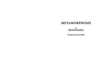
METAMORPHISIS (book binding)
This project required us taking the text from Kafka's 'Metamorphisis' and using InDesign to format and then create a physical book. I knew immediately that because of the nature of the text I wanted the book to look classic and to perhaps exploit the fact the text is relatively short and make it compact.
Covers I like:


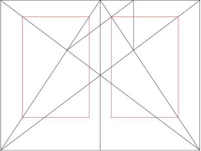
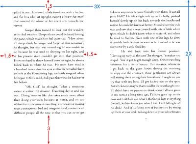
Having never done made a book before my first step was to investigate traditional methods of layout which brought to my attention The Van de Graaf canon. This is a reconstruction of a method that would have been used in book design in order to divide a page in pleasing proportions.
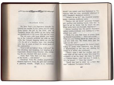

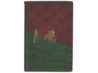
However when I tried placing the text onto the page using this method it did not appear aesthetically pleasing to me. In order to try and decide how I would place my text I decided to look for inspiration in books that I thought were well laid out. Aesthetically, I found I preferred the way older books looked, those printed using letterpress.
For example:

I appreciate the way the text is actually slightly indented into the sheets of paper and the slight imperfections which give each letter character. The above example influenced the placing of the text on the page.
I used equal measurements around the top and sides (1.5cm) with double this spacing at the bottom to balance the text (3cm).
I also choose to place the page numbers at the bottom centrally to add to the overall symmetry of each double spread.

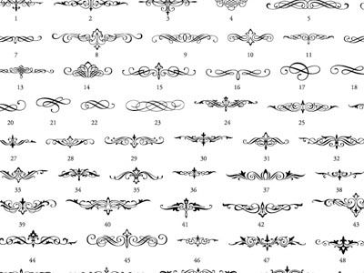
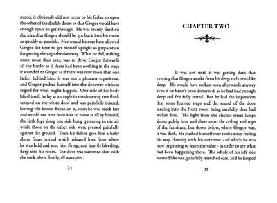
I also liked the inclusion of emblems as I feel this adds character and decoration without being over the top and drawing away from the text. When used at the begining of a chapter it also acts as a quick visual message that one has reached a break in the text.

Text
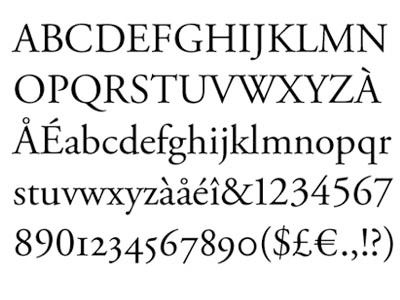
I knew I wanted to use a serif typeface as I was trying to create a classic style book. I choose a variation of Garamond, a typeface with letterforms that convey a sense of fluidity and consistency.


Subscribe to:
Comments (Atom)
